Modal
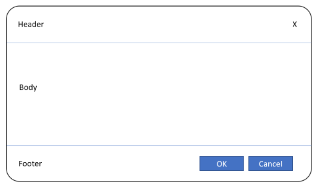
Renders a modal.
Node name : modal
Attributes
| Attribute | Type | Required | Default value | Description |
|---|---|---|---|---|
| overlay-id | string |
true if is-open is not defined |
An identifier allowing the modal to be opened with a toggle overlay button or by code. | |
| is-open | bool |
false |
A literal or bound value in two-ways indicating whether the modal is open. | |
| dismiss-on-click-outside | bool |
false |
false |
A value indicating whether the modal can be closed by clicking outside. |
| dismissible | bool |
false |
false |
A value indicating whether the modal can be closed by clicking on a close button. |
| maximizable | bool |
false |
true |
A value indicating whether the window can be expanded by clicking on a maximize button. |
| size | string |
false |
full |
Size of popup. full means that the window takes up all the available space. auto means that the window automatically sizes itself according to its content. |
| position | string (right, left, center) |
false |
center |
Position of modal. |
Sub components
| Child node | Description |
|---|---|
| modal-header | Modal header (e.g. title) |
| modal-body | Modal body (e.g. form or datagrid) |
| modal-footer | Modal footer (e.g. Ok and Cancel buttons) |
Examples
With overlay-id
The following example shows how to open a modal with a button (thanks to the overlay-id attribute).
<button type="toggle-overlay" overlay-id="MyModal" label="Open modal" />
<modal overlay-id="MyModal">
  <modal-header>
    <heading>Who are you?</heading>
  </modal-header>
  <modal-body>
    <vertical-layout>
      <form-field property-name="FirstName" />
      <form-field property-name="LastName" />
    </vertical-layout>
  </modal-body>
  <modal-footer>
      <horizontal-layout>
        <button type="method" method-name="Save" focused="true" label="OK" />
        <button type="method" method-name="Cancel" label="Cancel" />
     </horizontal-layout>
  </modal-footer>
</modal>
With is-open
The following example shows how to control the open state of the modal with a field.
<modal is-open="@Fields.IsModalOpened" dismissible="true" size="auto">
  <modal-header>
    <heading>Who are you?</heading>
  </modal-header>
  <modal-body>
    <vertical-layout>
      <form-field property-name="FirstName" />
      <form-field property-name="LastName" />
    </vertical-layout>
  </modal-body>
  <modal-footer>
      <horizontal-layout>
        <button type="method" method-name="Save" label="OK" focused="true" />
        <button type="method" method-name="Cancel" label="Cancel" />
     </horizontal-layout>
  </modal-footer>
</modal>
By default, the Fields.IsModalOpened UI view field (boolean) is false.
In a UI view event rule (Retrieved for example), the field can be set to true to open the modal.
The "OK" button is focused when the modal is displayed.
Methods.Save : UI view method (without return) that calls an API to save values and closes the modal using Fields.IsModalOpened = false;
Methods.Cancel : UI view method (without return) that closes the modal using Fields.IsModalOpened = false;